
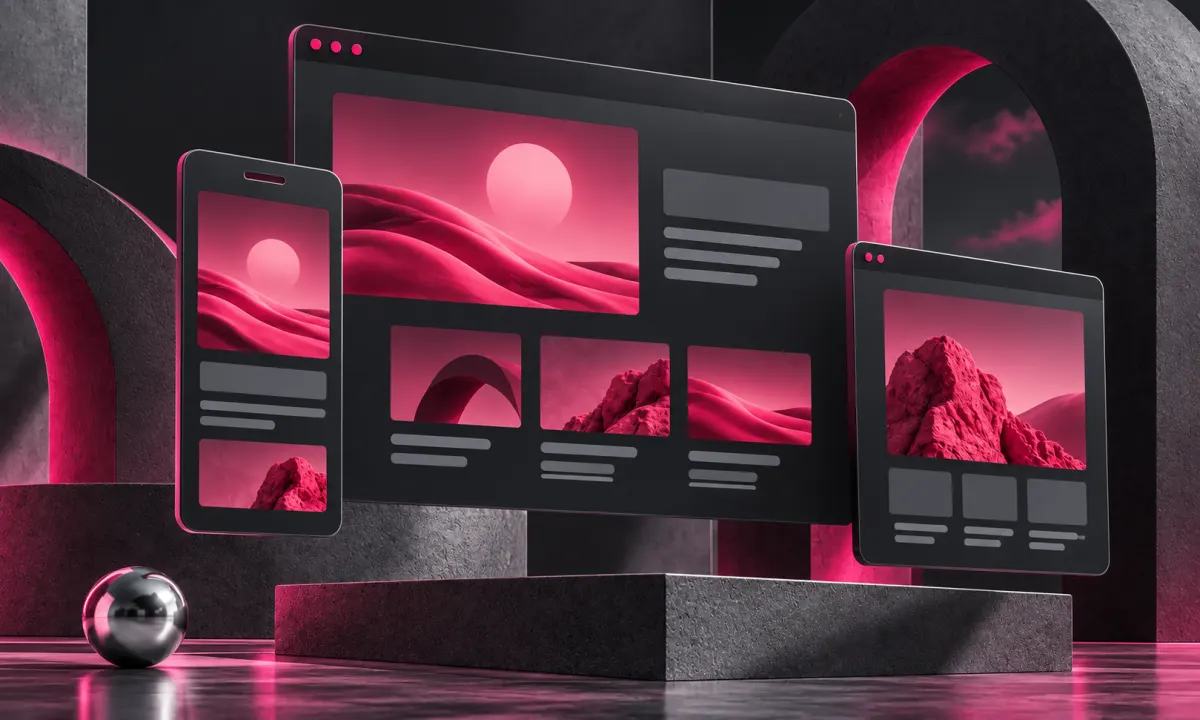
Responsive design means more than making columns narrower. A visitor should be able to understand the offer, navigate and complete their task on the device they have. A screenshot checks appearance; a real interaction checks whether the layout works.
Freelance front end web development should be reviewed with real content at narrow widths. When comparing freelance HTML5 developers, ask for semantic headings, usable forms and layouts that adapt without hiding important information. A responsive page needs enough space for translated text and larger reading sizes as well as a neatly scaled image.
Preserve the important order
When desktop columns stack, the order may stop making sense. Check that a heading stays close to the content it describes and that the primary action is not buried behind decoration. A large artwork can be beautiful, but it should not prevent a mobile visitor from finding the service or next step.
Test the navigation honestly
Use the menu, the language switch and the important links. Check keyboard focus as well as touch. Avoid controls that require hover to reveal essential information. A desktop interaction may need a different mobile form, rather than a smaller version of the same effect.
Complete the form on a phone-sized layout
Review labels, validation messages and input types. A wide button does not solve an unclear question. Ensure the status message is visible after submission and that the keyboard does not hide the information needed to proceed. Use synthetic contact details in tests.
Include slower conditions
Inspect image selection, content loading and layout stability. Test reduced motion and zoom where relevant. Do not assume a modern phone always has a fast connection. A practical review covers several representative widths and the actual journeys, with defects recorded for correction.
The finished design should retain its character across devices while respecting the task. That is a better target than making every breakpoint look like a scaled screenshot.
Explore the service and discuss your project.
Further reading: Freelance web design: make the first impression useful.
Sources & further reading
Have a correction or a question about this article? Contact Benoit.